
Pedro Kelly asked for a logo for Ciudad Fiel. The real problem was that a single mark had to hold two different things, a record label and a school for producers who are just starting, and work equally well signing a release and hanging on a classroom wall.



Ciudad Fiel is a music initiative with two sides: a record label and a school for producers who are just starting out. The identity had to work equally well signing a release and hanging on a classroom wall.

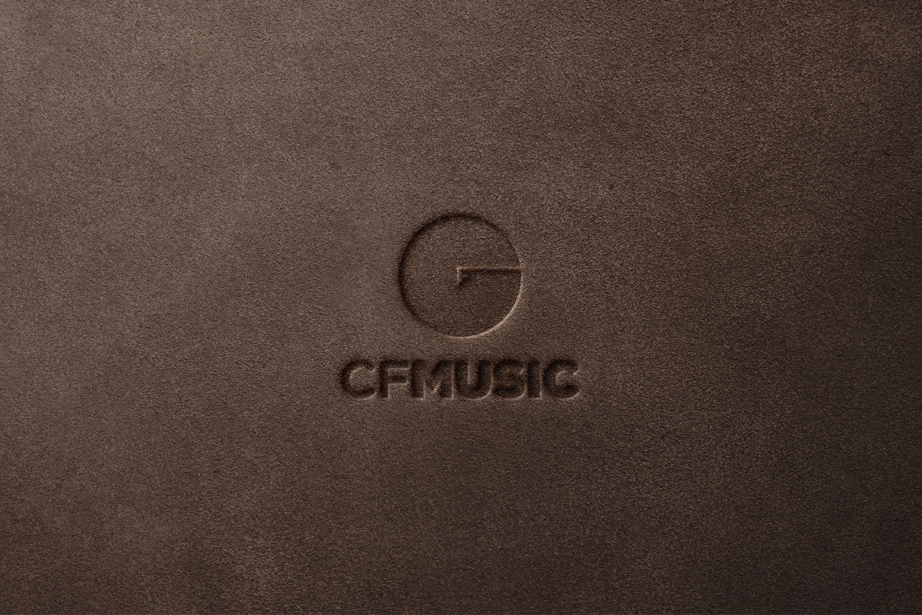
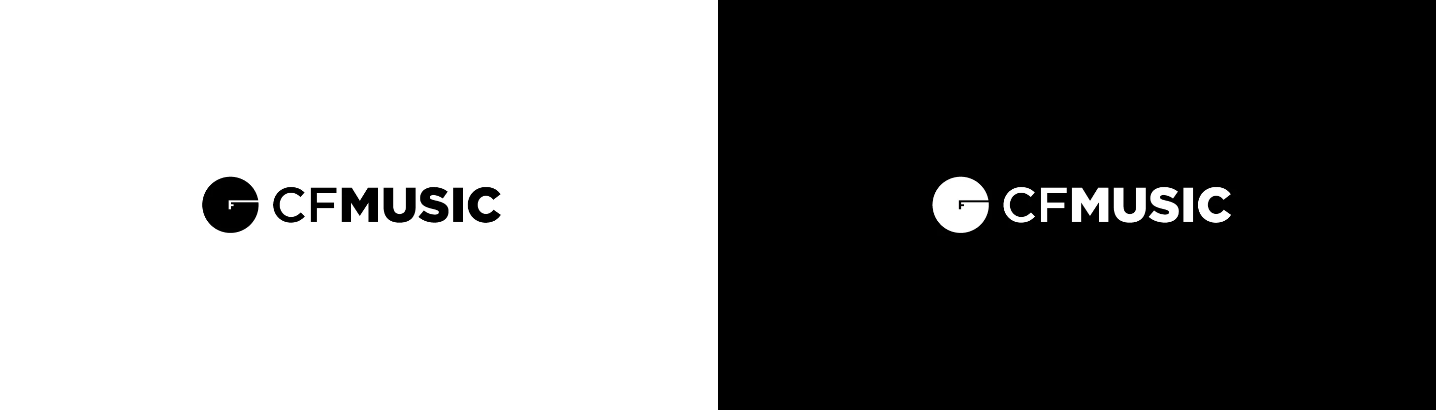
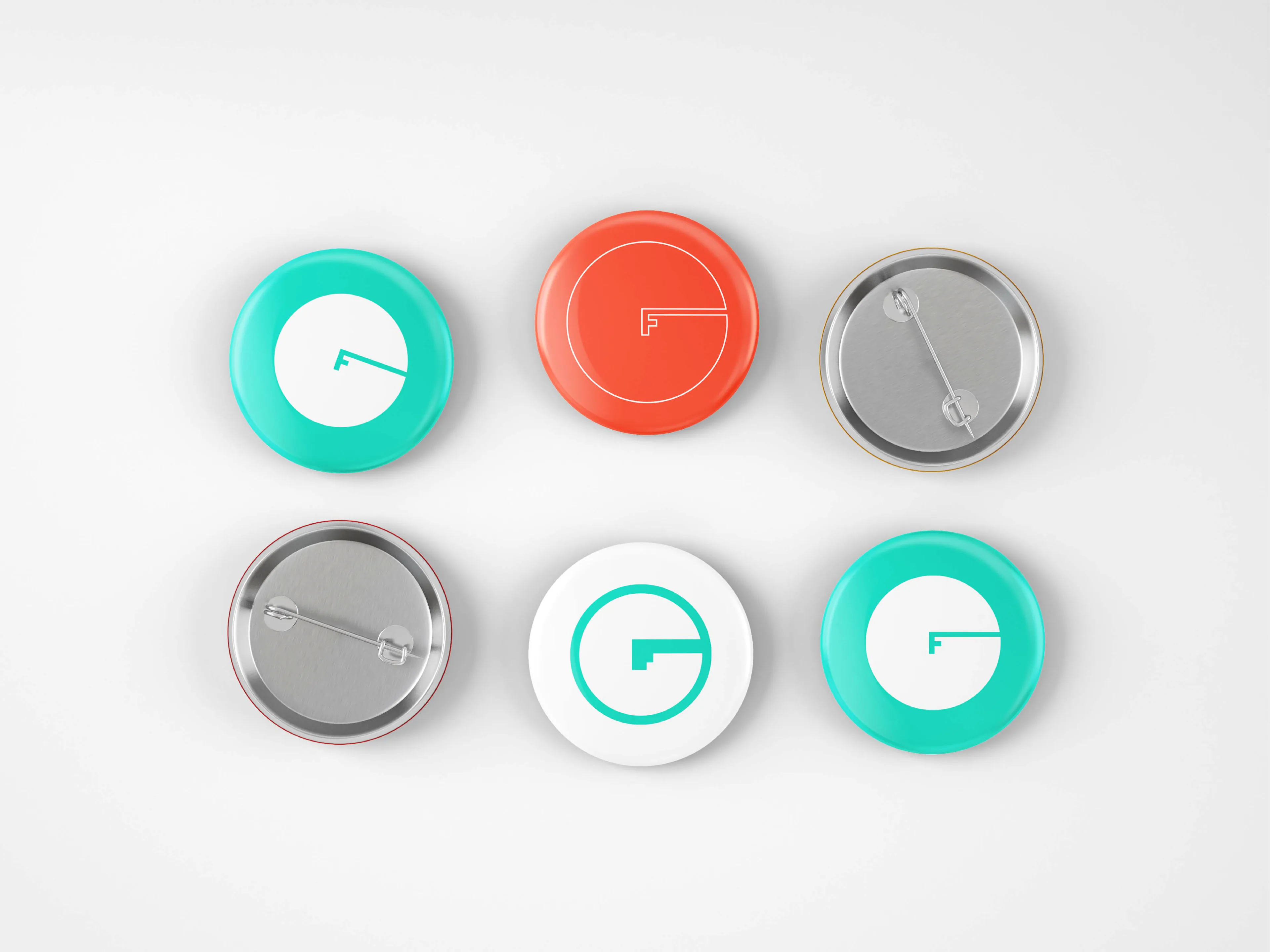
The symbol is a single move doing three jobs at once. Up close it is a C and an F locked together, and from across the room it is a turntable with the arm resting on the record. One filled circle, one clean cut, nothing else. That economy is what lets it be embroidered on a cap, die cut into a pin or embossed into leather without losing anything.
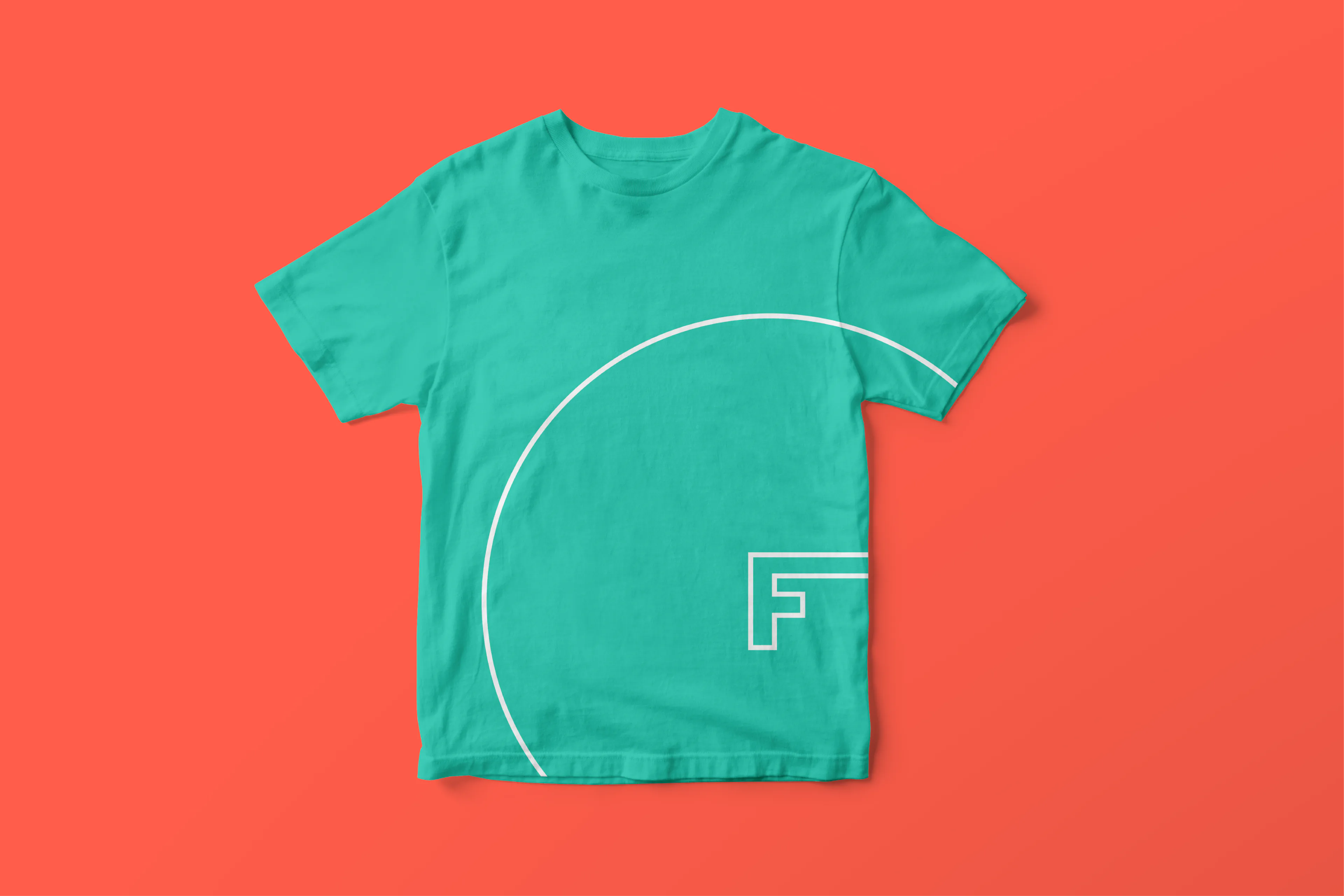
The system runs on mint green and warm red, two colors that fight just enough to read from a distance and get along in small pieces. The wordmark splits CF in light and MUSIC in bold so the parent brand and the music line share one block. On merch the symbol repeats at different rotations, like a record that never stops spinning.
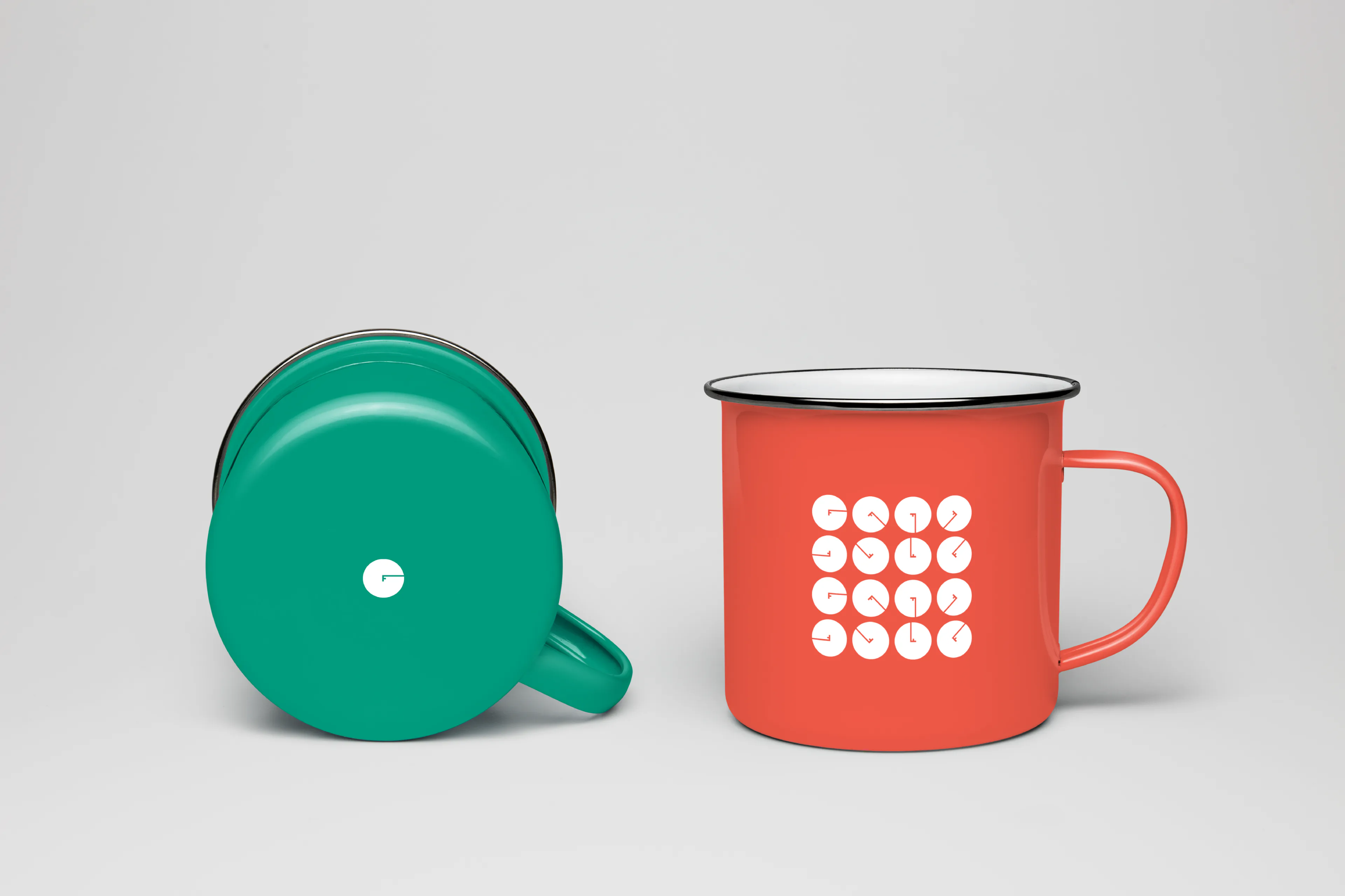



- A symbol that reads as C and F locked together up close, and as a turntable from across the room
- A wordmark splitting CF in light and MUSIC in bold so the parent brand and the music line share one block
- A two-color system, mint green and warm red
- Merch applications: embroidery, die cutting and leather embossing
- The brand is live and in use across Ciudad Fiel's channels.
- One symbol covers both the label and the school, with no need for two brands.
- The economy of the mark let it be embroidered, die cut and embossed without being redrawn.
Brand identity: Molly Yllom