
The brief
POS does commercial architecture and fixtures: it builds the spaces where brands sell. The brief was to redesign its logo.

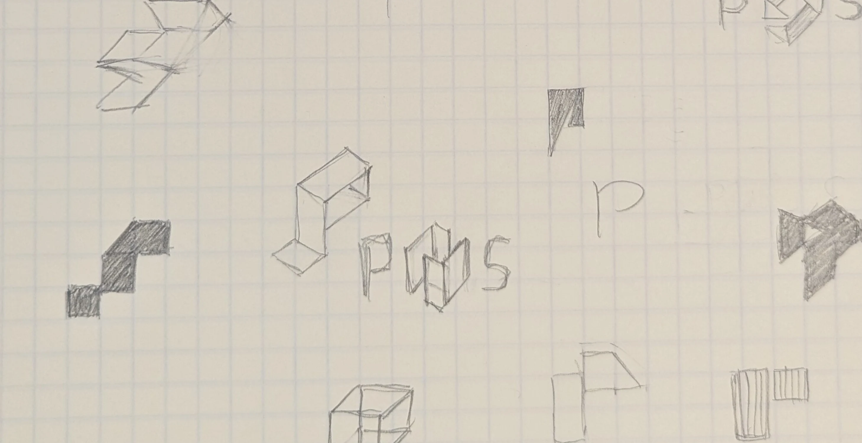
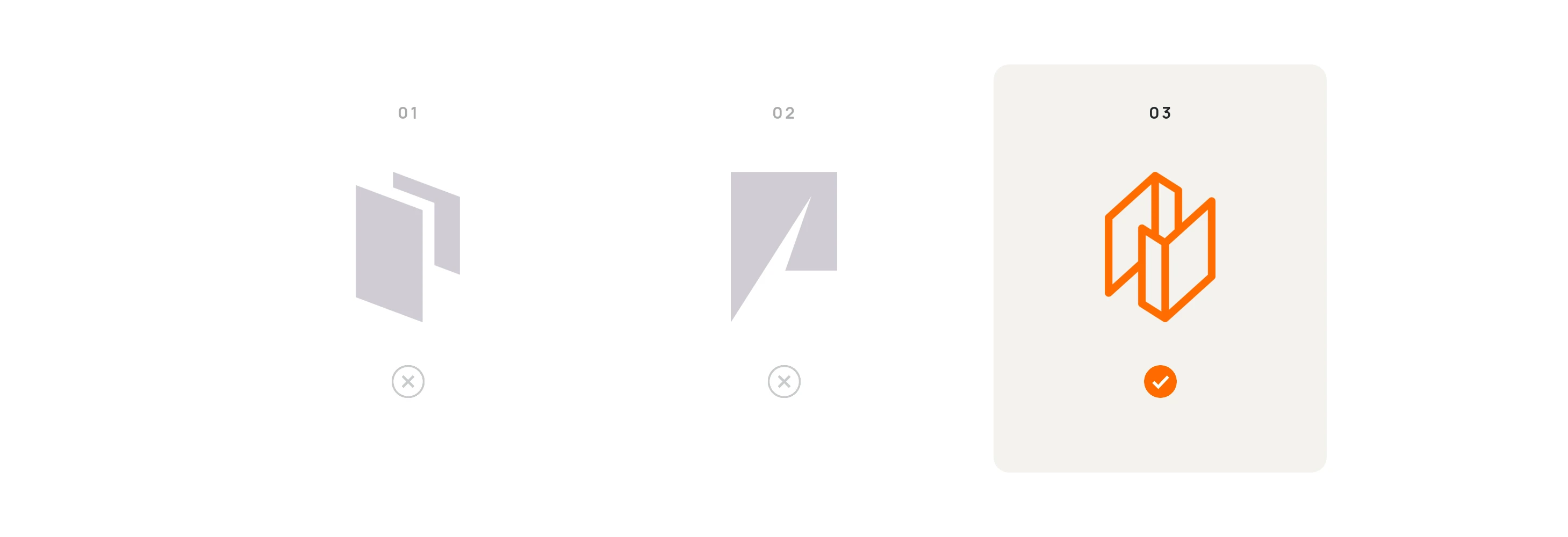
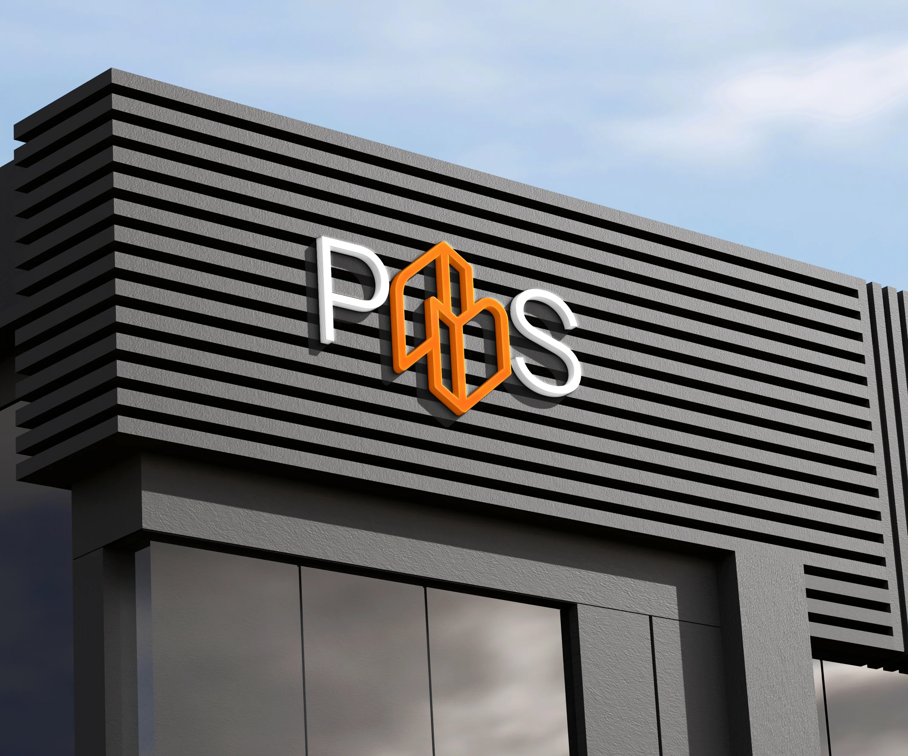
POS builds the spaces where brands sell, so the O in the name became a building. The idea came out of the sketch sheet, among many others, and of the three routes that made it to vector it was the one that stayed.
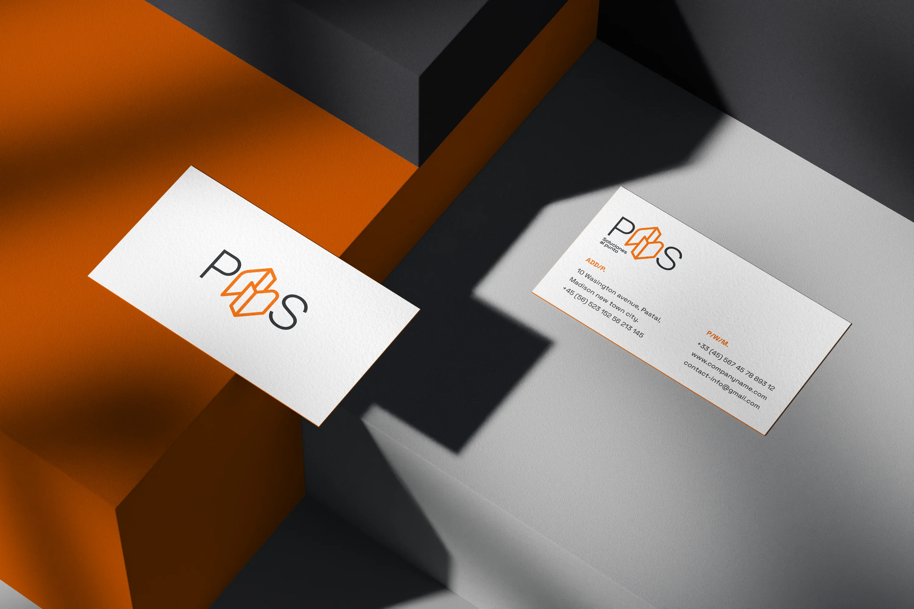

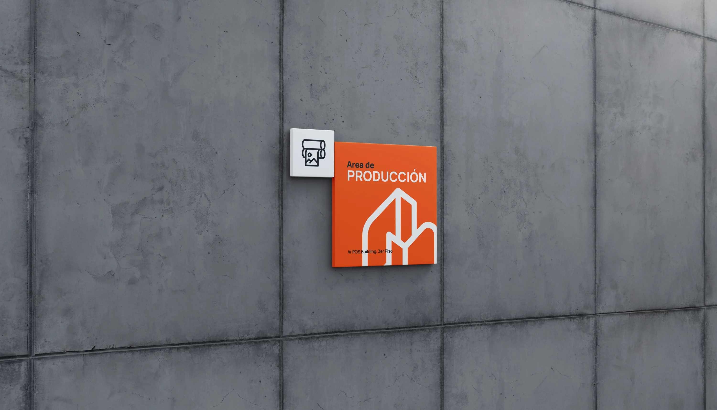

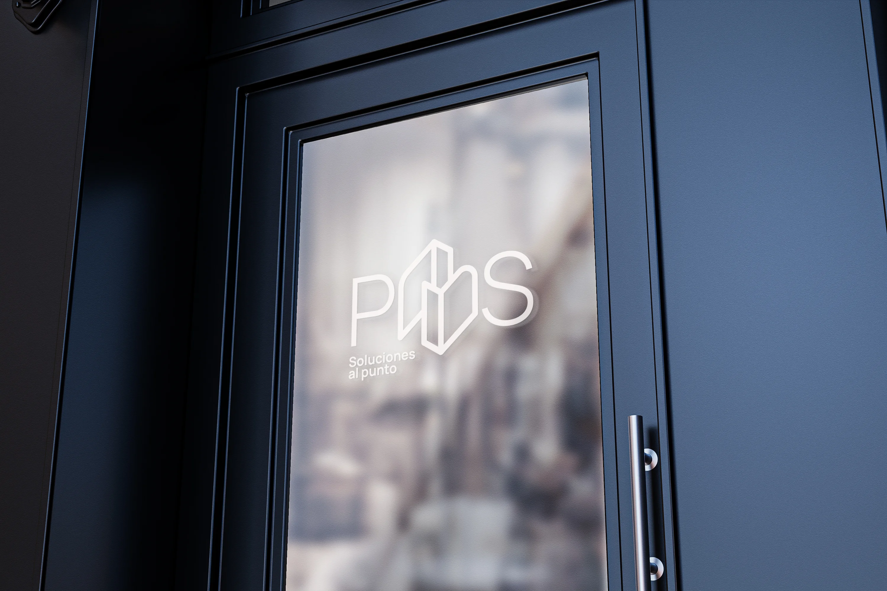
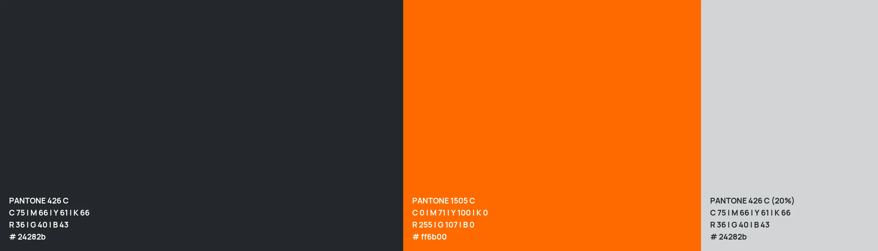
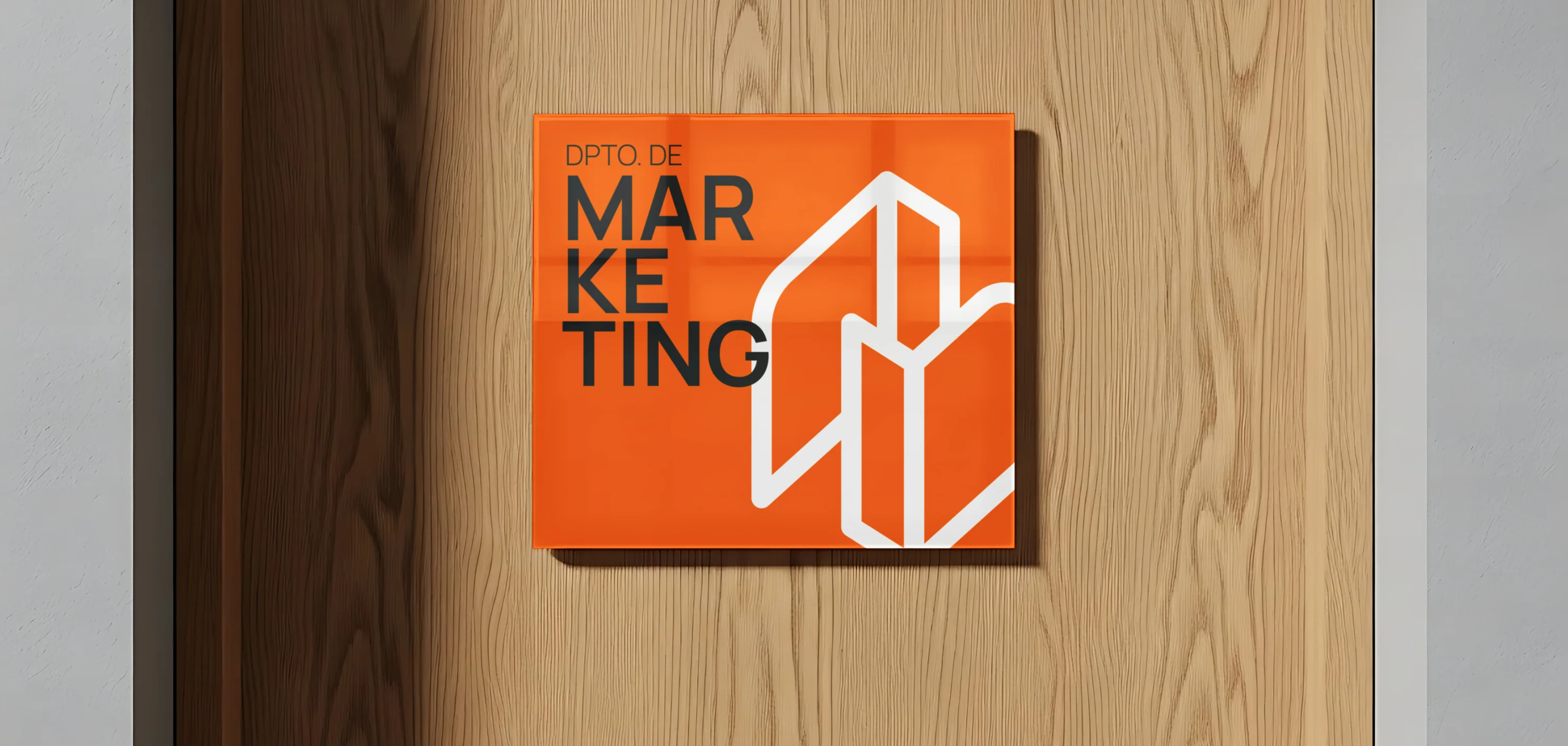
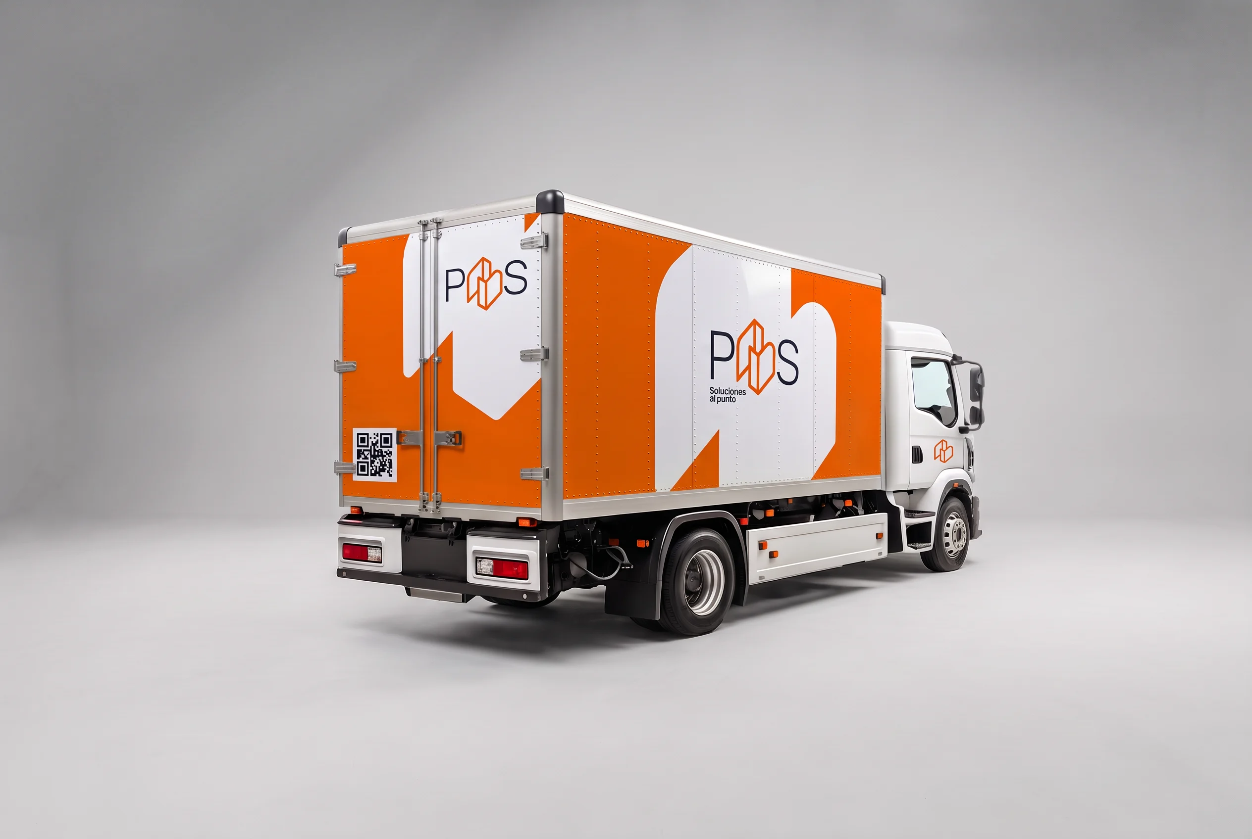
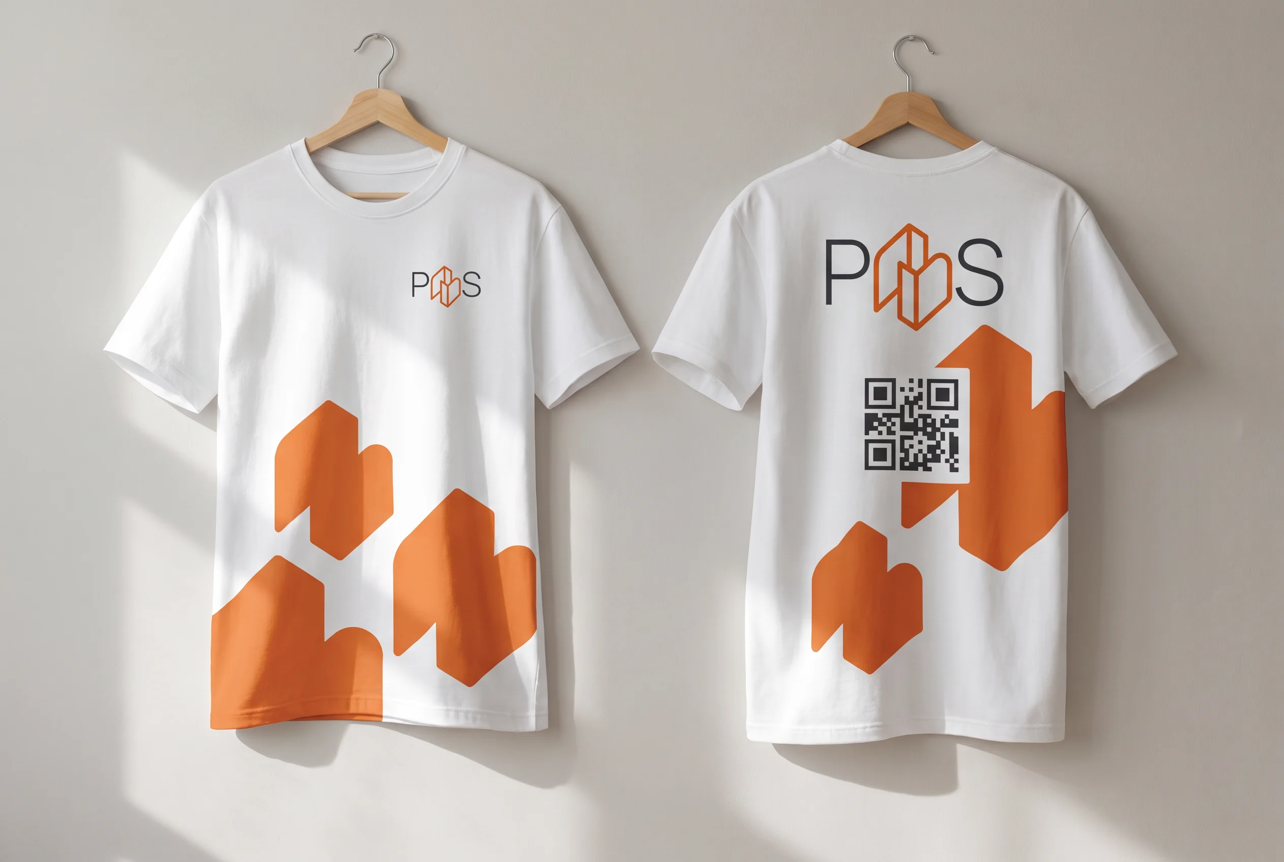
Then came the part that barely shows: softening corners, building the lockups, choosing color and type, and taking it onto signs, doors, business cards, the truck and T-shirts to check that it holds up off the screen.



What shipped
- A sheet of hand sketches, which produced three routes
- A symbol in which the O becomes a building
- Five logo lockups: horizontal, vertical, icon only, with the tagline and with the icon on the left, each in color, white and negative
- A charcoal and orange palette, set in Manrope
- Applications: facade, office sign, doors, business cards, truck and T-shirts


Credits
Logo redesign and identity: Molly Yllom