

A New York law firm that needed to not look like every other law firm. The whole category looks the same: navy, gold and the scales of justice. The brief was to convey balance and trust without landing on any of those clichés.


Balance was solved with stones, not with scales. Three circles and two beams resting on a fulcrum: a stack that holds itself up, caught at the exact moment it finds its point.
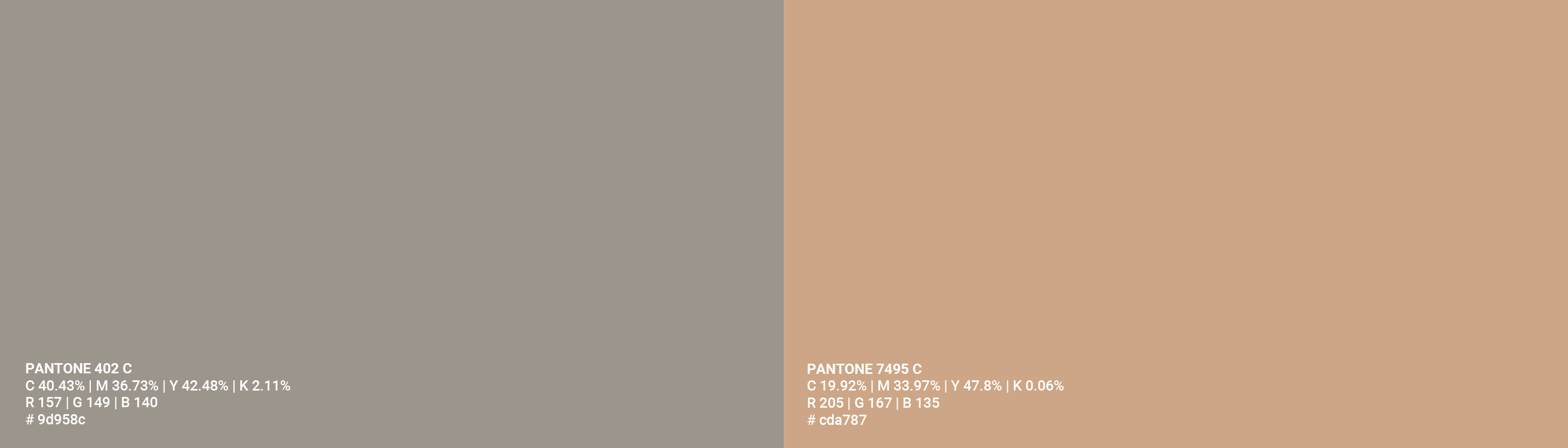

The real decision was to change the temperature of the category. Instead of the navy and gold the whole sector wears, the brand runs on taupe and peach. A classical serif carries the seriousness a law firm needs, and a spaced sans underneath lowers the tone just enough that it does not read like a practice from the last century.
The symbol was drawn for emboss. Solid shapes, no hairlines, no detail that disappears when the paper is pressed. That is why it holds up in blind emboss on black paper, in gold, and carved into a wooden stamp.


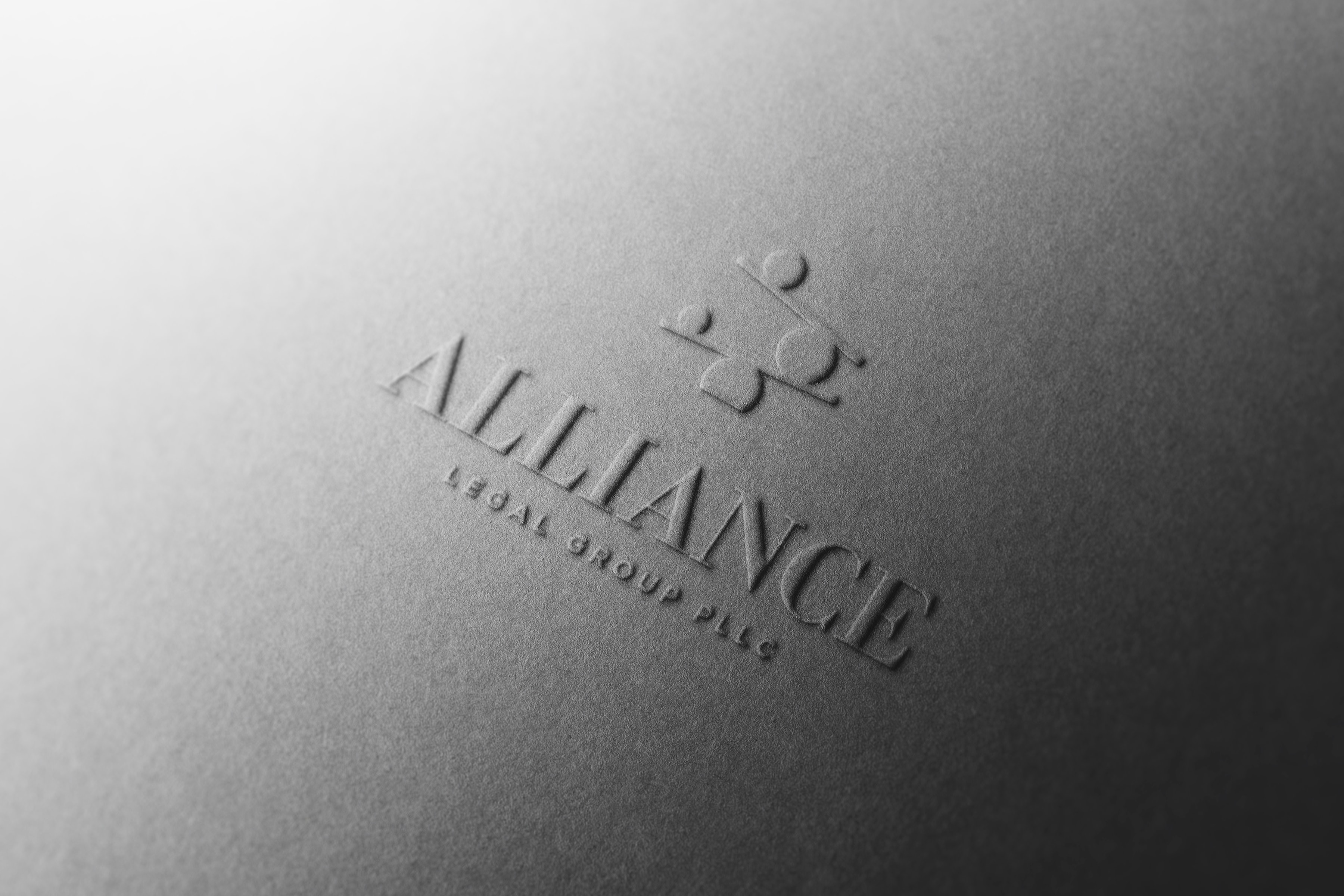
- Symbol: stones stacked in balance on a fulcrum, the idea of equilibrium without the literal scales
- A classical serif wordmark with «Legal Group PLLC» set in spaced sans beneath it
- A warm taupe and peach palette instead of the category's navy and gold
- Embossed applications: black paper, gold emboss and a wooden stamp
- A US client, in New York, worked remotely from Santo Domingo.
- The brand delivers balance and seriousness without using a single stock cue from the sector.
- The symbol holds up in blind emboss, in gold and as a wooden stamp without losing legibility.
Brand identity: Molly Yllom