
The brief
Neustack needed to modernize its image without becoming another company. The brief was to update, not reinvent: keep the simplicity it already had and give it a more confident read.

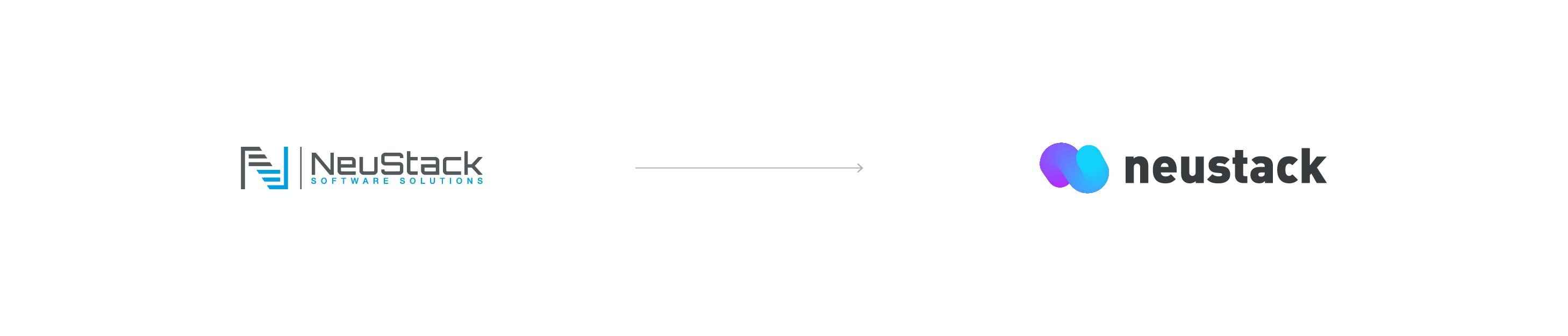
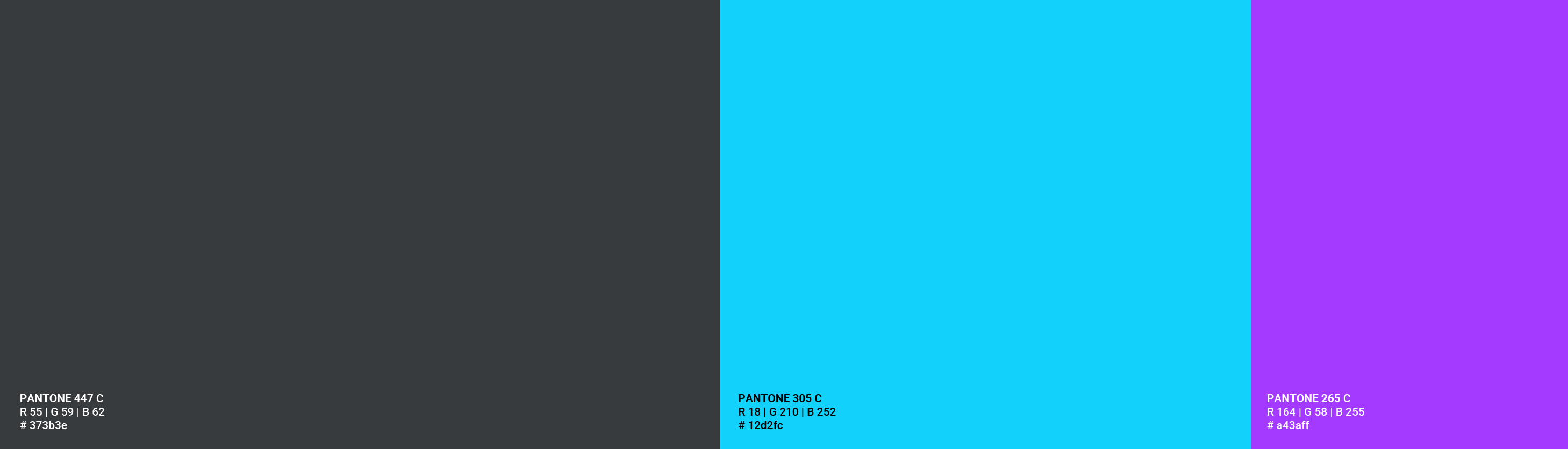
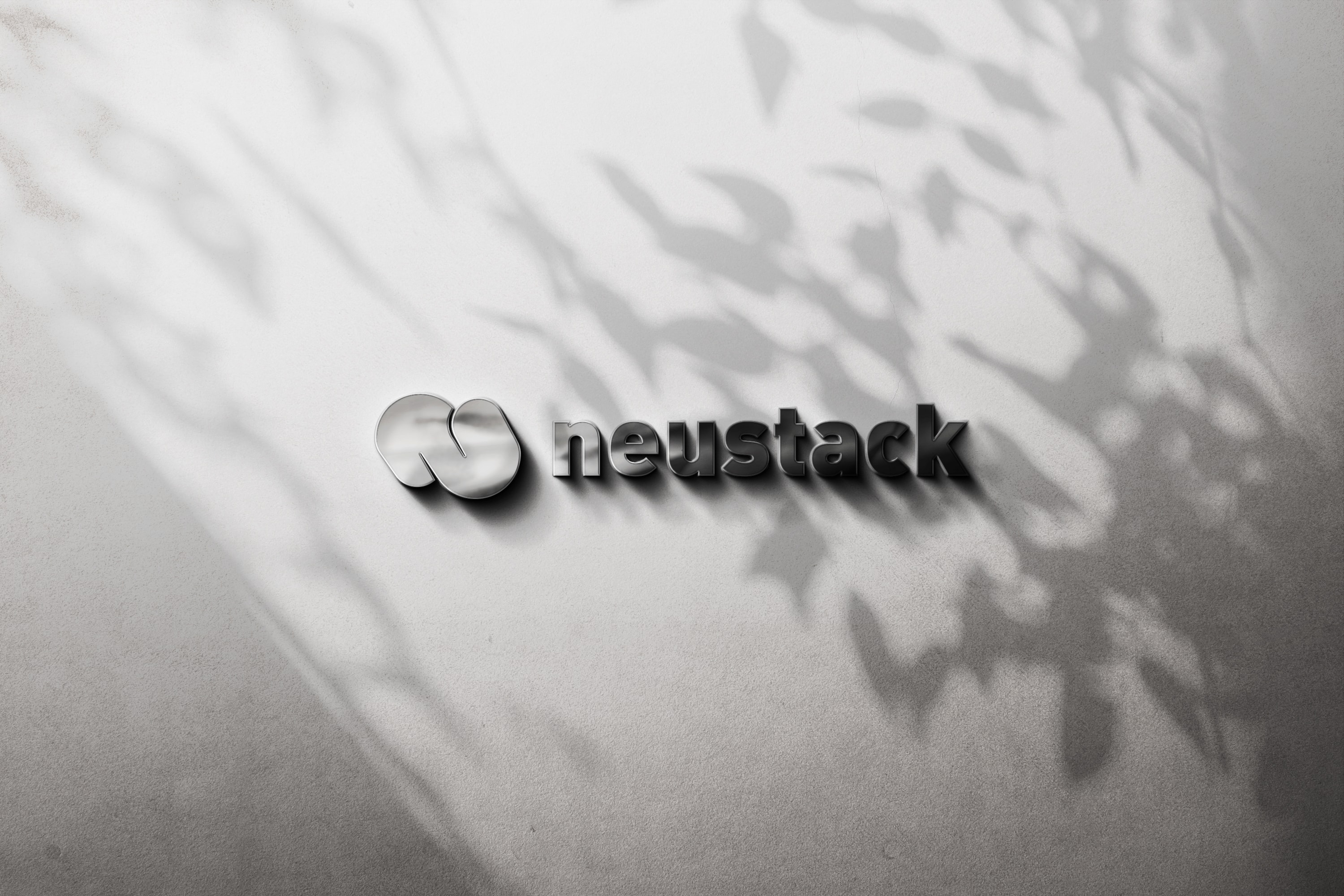
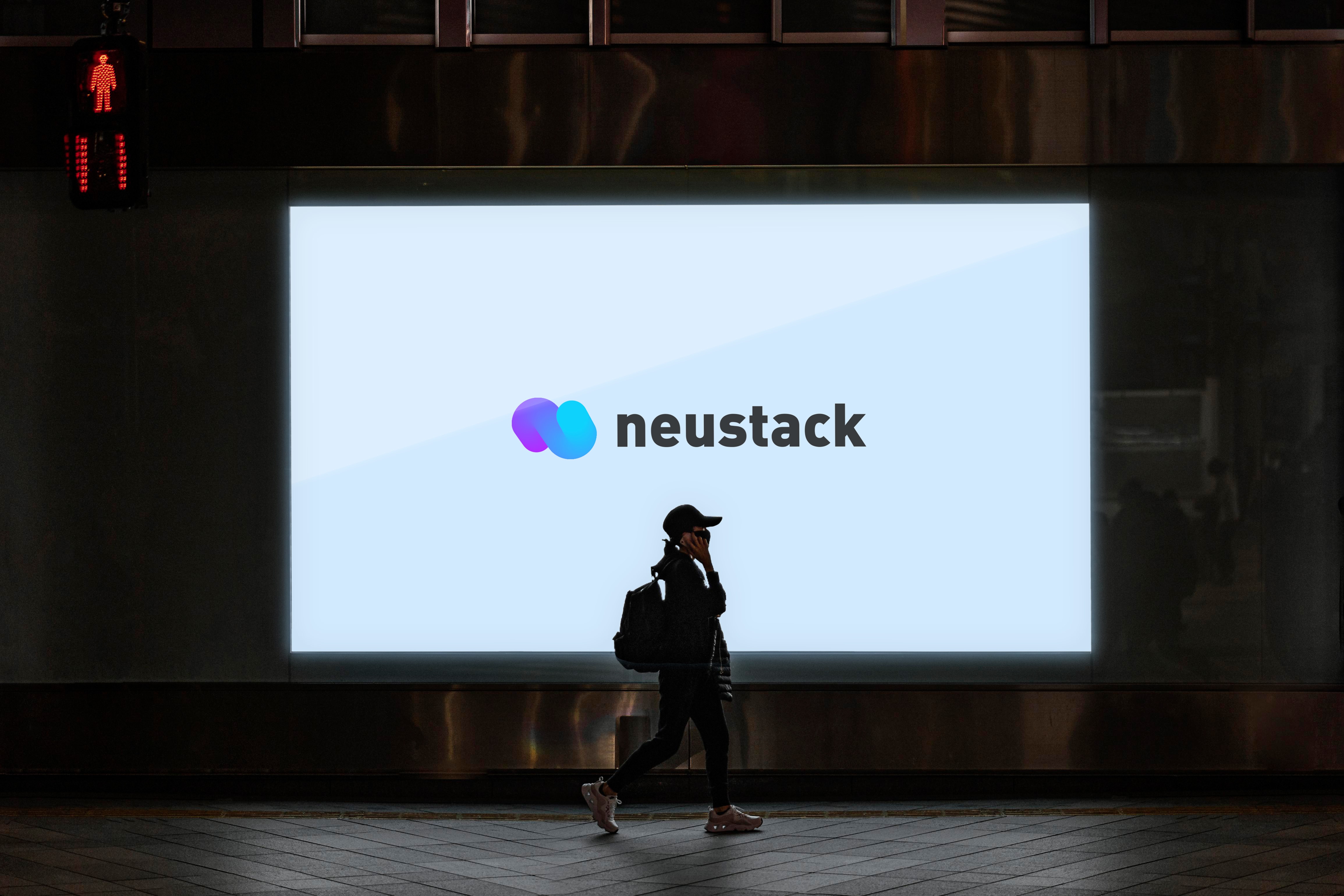
The logo redesign for Neustack aimed to modernize its image while maintaining simplicity. I represented the letter N with a bold, vibrant line, symbolizing the company's audacity in turning ideas into execution.


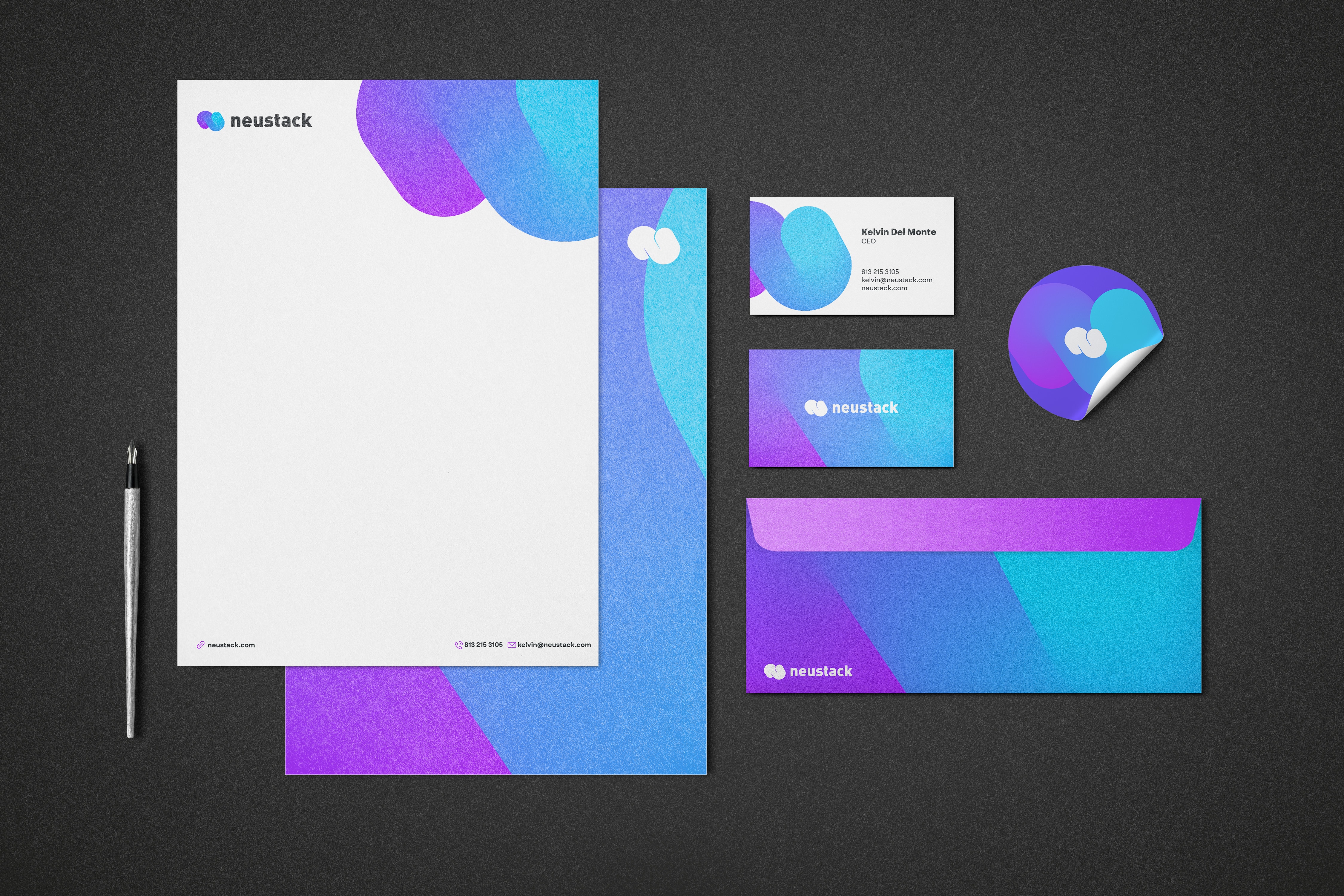
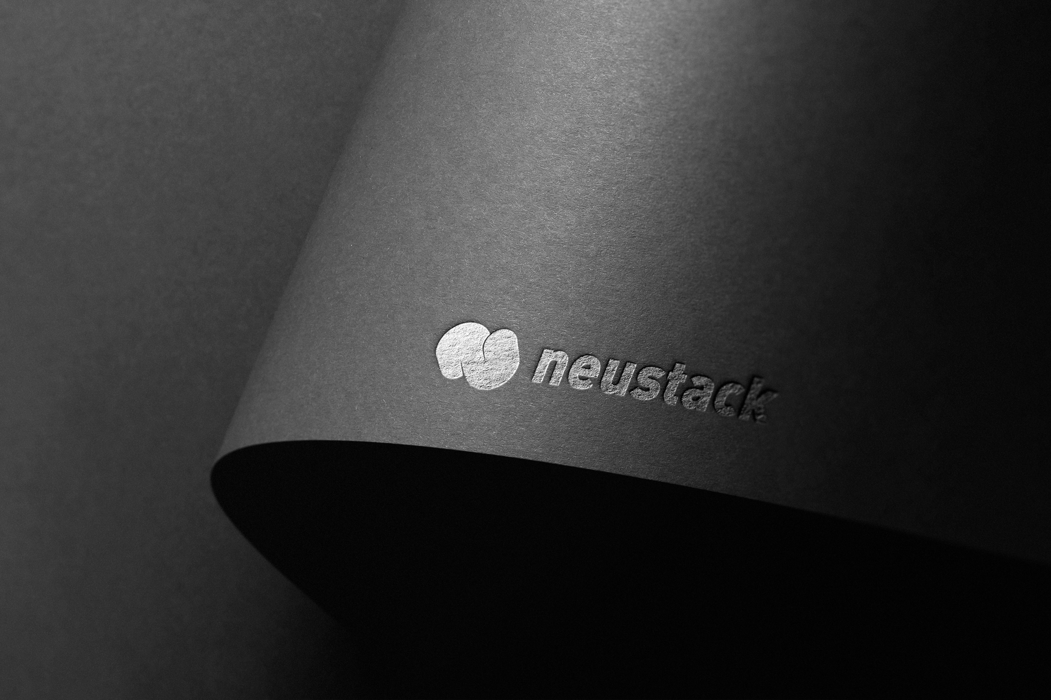
Blue carries the trust the sector expects and gray keeps it from shouting. The mark was built to survive being shrunk to a favicon and blown up to a trade stand without redrawing.



What shipped
- The letter N resolved in one bold, decided stroke
- Blue for trust, gray for balance
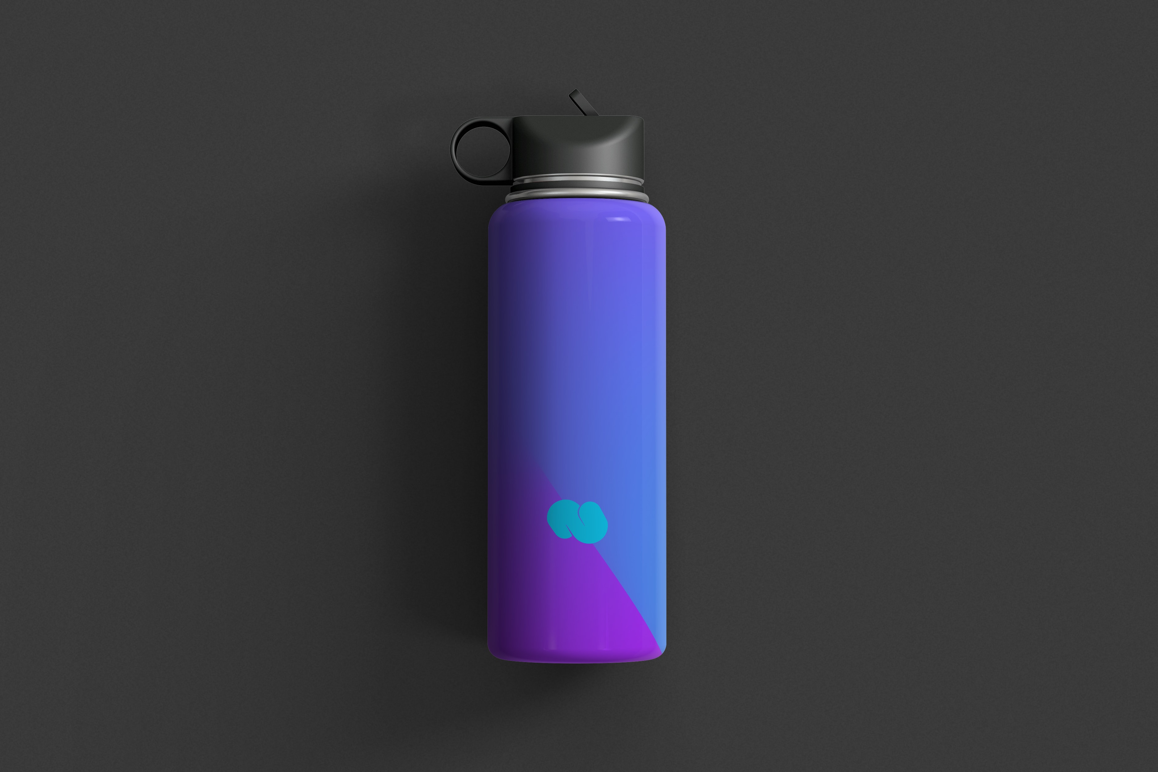
- A mark built to scale from favicon to trade stand
Outcome
- The brand is on hold, waiting on the company's relaunch as a product studio.
Credits
Identity redesign: Molly Yllom